
Identity
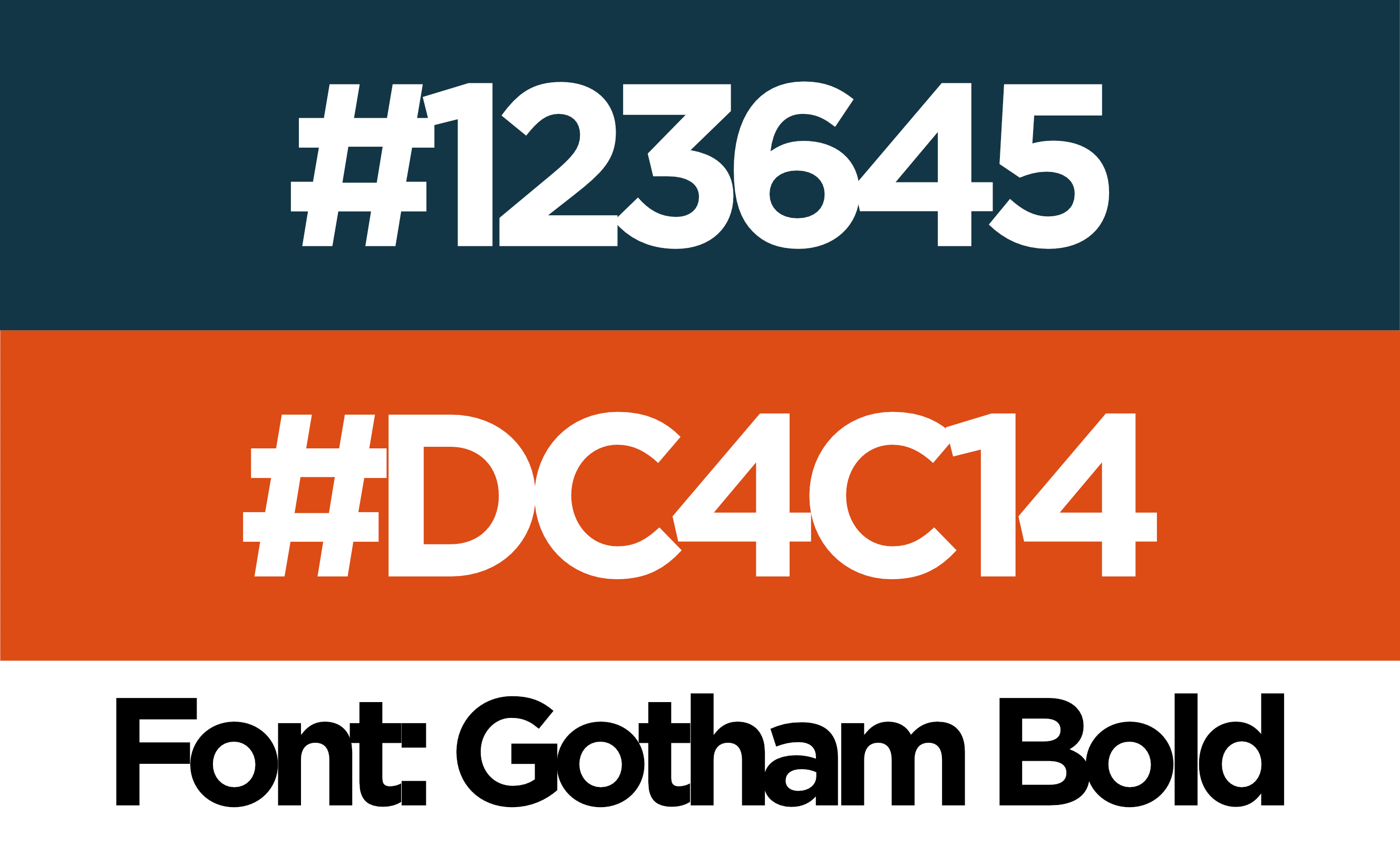
Logo system in four lockups, colour and type spec, source files handed over. The checkmark was chosen before anything else — it is the whole promise in one shape.
Logo · Brand System · Social Media
MinAuto sells certified pre-owned stock out of a lot on Mosley Street in Wasaga Beach, OMVIC registered. We built the identity around the one thing that decides a used-car sale — whether the car passed. The tick that makes the logo does not stay in it: it becomes the seal stamped on a price, the bullet on every proof point, and the whole right-hand side of the business card.
“Certified Pre-Owned. Driven by Trust.”
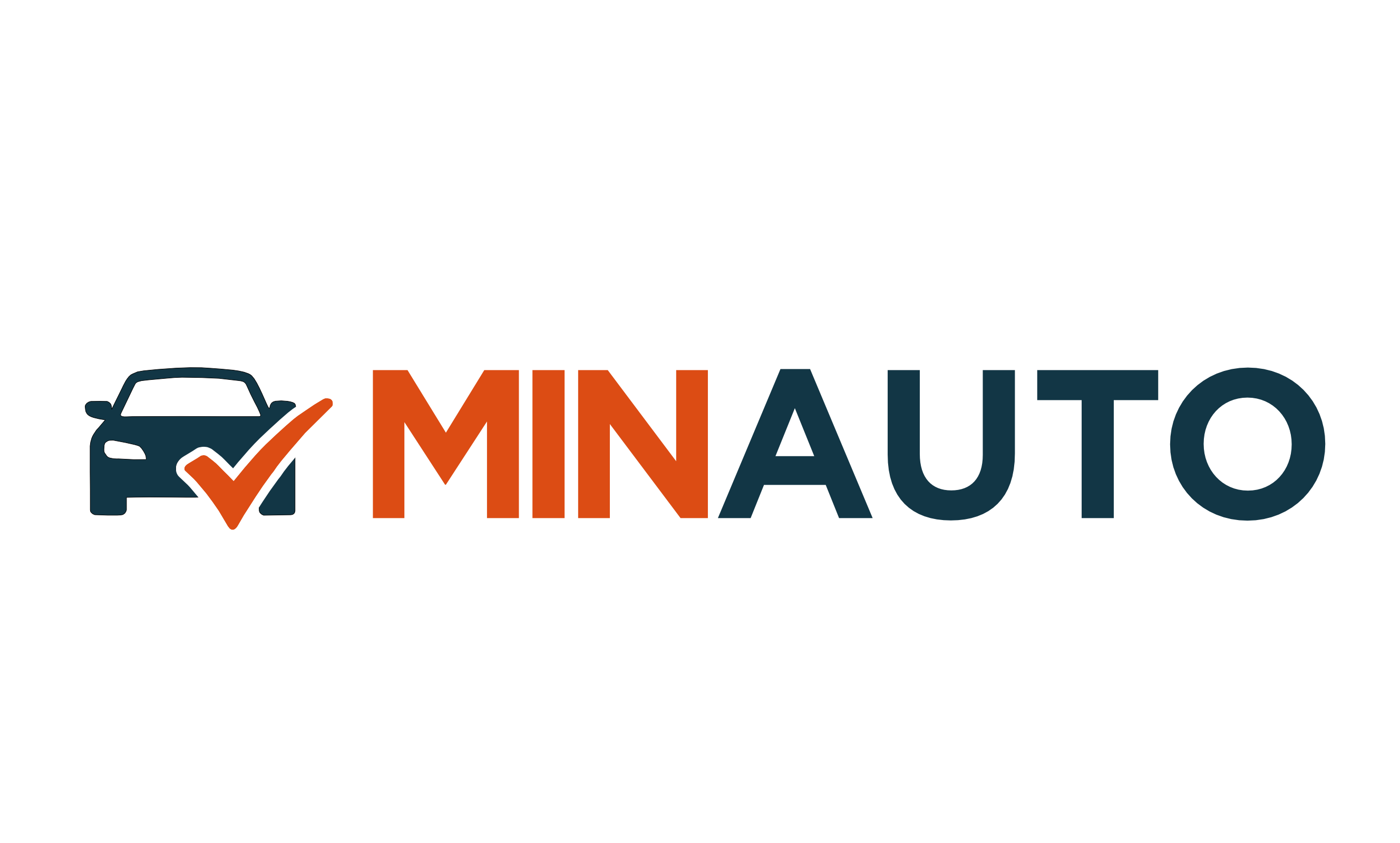
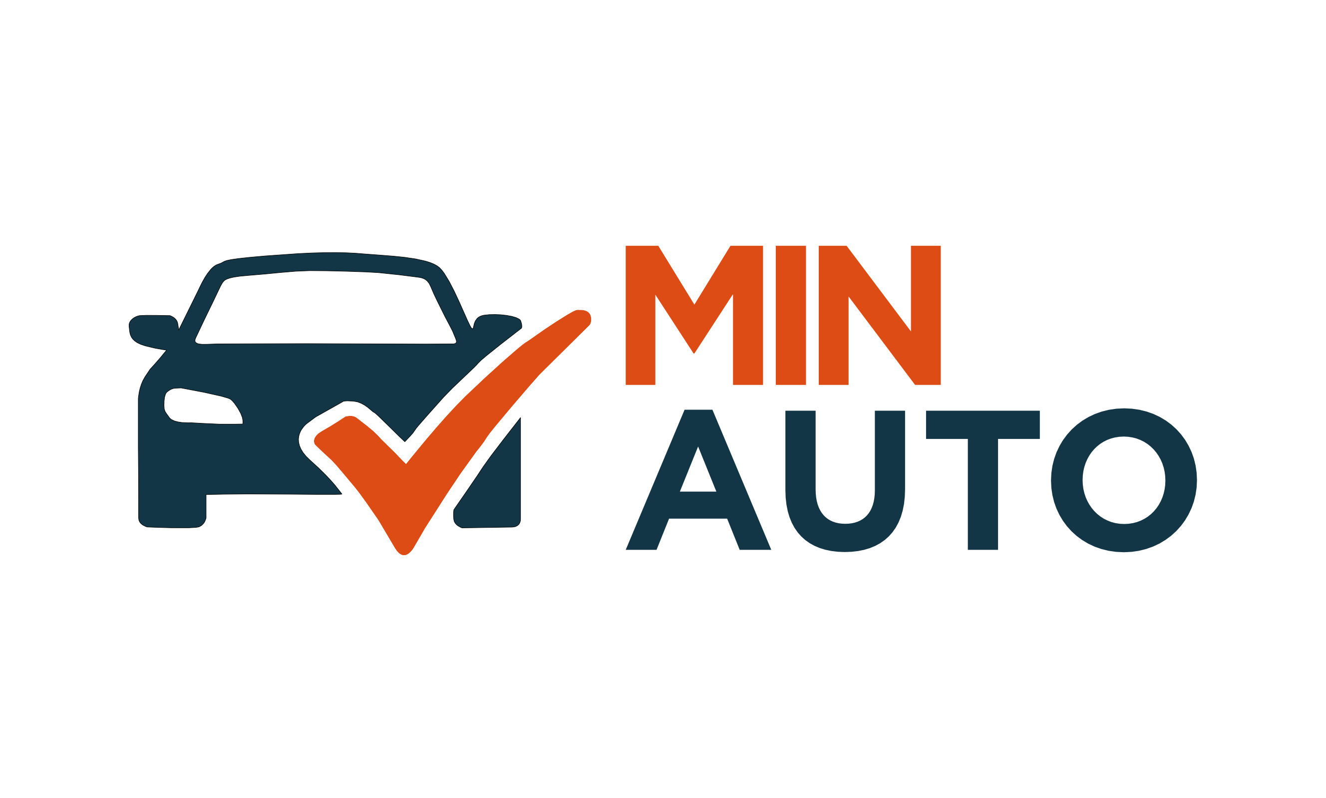
A used-car buyer is not shopping — they are checking. So the logo is a check.
The car front is drawn flat and calm; the tick sits over it in safety orange, the one colour that means go on a work site. It reads at signage size and it survives at favicon size, because the tick alone is already the brand. The wordmark splits the same way the business does — MIN in orange, the part that is theirs; AUTO in navy, the part that is the category.

The mark leaves the logo.
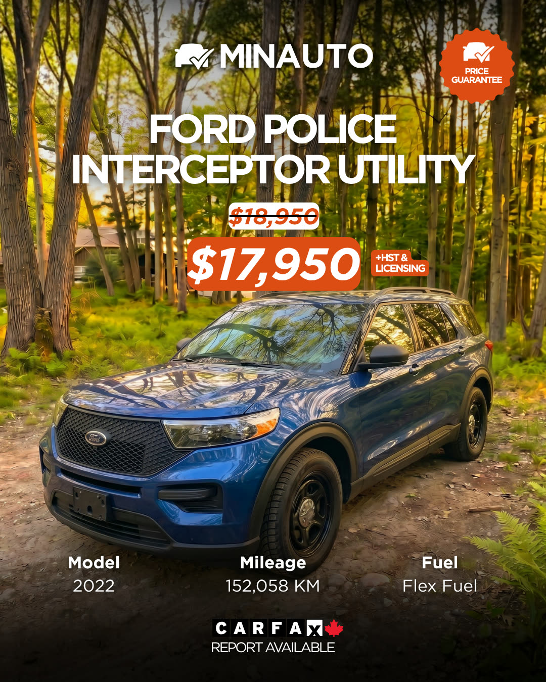
Every listing starts as a phone photo on the lot. The template does the rest: the vehicle name across the top, the price in an orange pill because the price is the action, and a spec strip along the bottom carrying model, mileage and fuel. Same moves every time — the dealership shoots a car, drops it in, and the post is on brand before anyone has thought about design.
Then it got sharper in use. The current card moves the logo up out of the photograph, strikes the old price through instead of quietly replacing it, and adds two pieces of proof the first version did not have: a price-guarantee seal and a Carfax badge. Same skeleton, more evidence.
Tap the tabs. Launch card ⇄ current card.

Three carousels that argue, six listings that sell.
The carousels do the work a listing cannot: explain what OMVIC registration actually buys you, hand over the three checks any buyer should run, and stretch the template to a travel trailer. Every proof point in them is ticked off — the same gesture the logo is built on.
Logo system in four lockups, colour and type spec, source files handed over. The checkmark was chosen before anything else — it is the whole promise in one shape.
Instagram and Facebook business pages built from nothing. Facebook first: the 35–65 buyer this dealership actually sells to lives there, not on Instagram.
An inventory card any listing drops into — photo, corner tag, spec strip, price. Seven Canva templates so the client can keep shipping without us.
Three buyers, one tone: the fleet owner, the credit-rebuilder, the family afraid of a lemon. Same warmth, different fear answered.